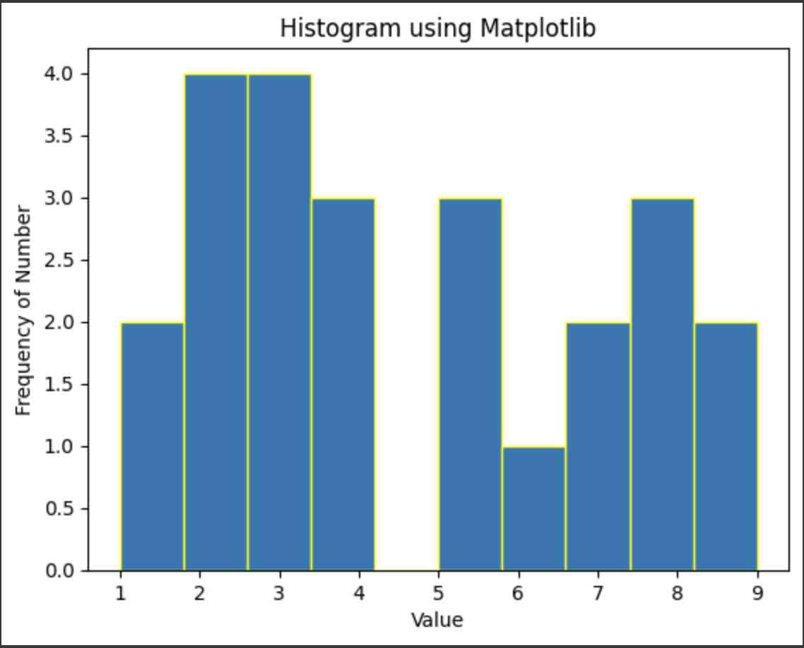
We can make use of the matplotlib.pyplot.hist() function from the Matplotlib in Python to plot a histogram.
Example:
import matplotlib.pyplot as pyplot

plotting_data = [3, 5, 2, 3, 2, 4, 3, 8, 9, 2, 5, 6, 4, 4, 3, 2, 1, 5, 8, 1, 7, 7, 8, 9]

pyplot.hist(plotting_data, bins=10, edgecolor='yellow')
pyplot.xlabel('Value')
pyplot.ylabel('Frequency of Number')
pyplot.title('Histogram using Matplotlib')
pyplot.show()
Documentation: https://matplotlib.org/stable/api/_as_gen/matplotlib.pyplot.hist.html
Facing issues? Have Questions? Post them here! I am happy to answer!
Author Info:
Rakesh (He/Him) has over 14+ years of experience in Web and Application development. He is the author of insightful How-To articles for Code2care.
Follow him on: X
You can also reach out to him via e-mail: rakesh@code2care.org
More Posts related to Python,
- How to convert int to ASCII in Python
- How to make use of SQLite Module in Python?
- Split a String into Sub-string and Parse in Python
- Python: Pandas Rename Columns with List Example
- How to run Python file from Mac Terminal
- How to Exit a Loop in Python Code
- Python: How to Plot a Histogram using Matplotlib and data as list
- MD5 Hashing in Python
- Jupyter: Safari Cant Connect to the Server localhost:8888/tree
- Fix: AttributeError: str object has no attribute decode. Did you mean: encode?[Python]
- How to Read a binary File with Python
- How to add two float numbers in Python
- Python: How to install YAML Package
- Python: How to Save Image from URL
- What is Markdown in Jupyter Notebook with Examples
- How to change the Python Default version
- 33: Python Program to send an email vid GMail
- How to comment code in Python
- How to Fix AttributeError in Python
- Fix: error: Jupyter command `jupyter-nbconvert` not found [VSCode]
- How to comment out a block of code in Python
- List of All 35 Reserved Keywords in Python Programming Language 3.11
- Import Other Python Files Examples
- Python: How to add Progress Bar in Console with Examples
- 3 Ways to convert bytes to String in Python
More Posts:
- Python Program: Use NumPy to generate a random number between 0 and 1 - Python-Programs
- Fix: Eclipse Connection time out: github.com - Eclipse
- MacBook - Time Limit - You have reached your time limit, Ignore Limit - MacOS
- Create Custom Android AlertDialog - Android
- Python: Pandas Rename Columns with List Example - Python
- How to configure PDF iFilter for SharePoint - SharePoint
- Upload Pdf file using PHP Script - PHP
- Align html element at the center of page vertically and horizontally - Html