Although it's 2024, many developers still rely on the jQuery library for its ease of use in JavaScript. If you need to obtain the screen width and height of your browser window using jQuery, look no further than the following code. As you resize your browser window, the width and height values of the frame are automatically displayed.
This code can be quite handy when testing the responsive design of your website. You can view this page on various devices to get the height and width.
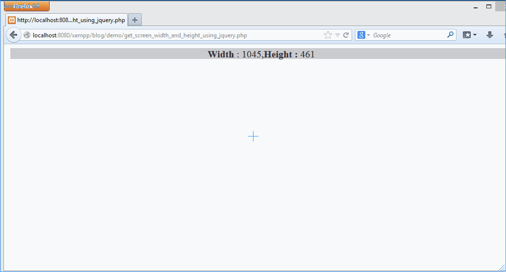
You can see the below gif demo that as we resize the browser window, we get the correct width and height size in pixels.
Note: There is an easier way to do this using the Chrome browser Inspect option, Right Click on any web page and click on Inspect, click on "Toggle Device Toolbar" and select the responsive option, drag the width and height to know how your page renders and what the page dimensions are.
Frequently Asked Questions (FAQ):
How can I get the browser screen width using jQuery?
let screenWidth = $(window).width();
How do I obtain the browser screen height with jQuery?
let screenHeight = $(window).height();
Example of modifying content based on screen dimensions in jQuery?
if ($(window).width() < 768) {
    // Adjust content for smaller screens
} else {
    // Content for larger screens
}
How to detect screen size changes in real-time using jQuery?
$(window).resize(function() {
    // Your code to execute when the screen size changes
});
What are some jQuery plugins for responsive design?
Bootstrap or Foundation for responsive design.
How to check if the screen width is less than 768 pixels using jQuery?
if ($(window).width() < 768) {
    // your code when width less than 768px
}
How to adjust image sizes dynamically using jQuery?
let newImageWidth = $(window).width() * 0.8;
$('#myImage').css('width', newImageWidth + 'px');
jQuery code for showing/hiding elements based on screen size?
There could be various reasons one may want to get the width and height of a web browser,
In order to create a responsive website that adapts to the different screen sizes (mobile/laptops), you need to know the screen width and height so that you can adjust the layout accordingly.
Knowing the screen size of the user could help you customize the user experience for different devices. For example, you might want to display a mobile-friendly version of your site on small screens or show a larger version of images on larger screens.
This may also help to track the screen size of your visitors to help you analyze their behavior and preferences. For example, you might find that visitors using smaller screens tend to click on certain areas of your site more frequently than those using larger screens.
If you display ads on your website, it could be so that you need to know specific screen sizes for displaying ads, so by knowing the screen size, you can ensure that the appropriate ad is displayed to the user.
Comments & Discussion
Facing issues? Have questions? Post them here! We're happy to help!
Provide Feedback For This Article
We take your feedback seriously and use it to improve our content. Thank you for helping us serve you better!
Thanks for your feedback! If you have time, please provide details by selecting options below.
😊 Thanks for your time, your feedback has been registered!

Comments & Discussion
Facing issues? Have questions? Post them here! We're happy to help!