
There are various colors that Bootstrap provides for the buttons, there are 8 classes that you can make use of along with btn,
Bootstarp Button Color Classes:
- btn-primary: Blue
- btn-secondary: Grey
- btn-success: Green
- btn-danger: Red
- btn-warning: Yellow
- btn-info: Blueish
- btn-light: White
- btn-dark: Black
As you can the buttons are not named as per color but rather what the color signifies, let's see examples and see how they look,
Code Snippet:<button type="button" class="btn btn-primary">Primary: Blue</button>
<button type="button" class="btn btn-secondary">Secondary: Grey</button>
<button type="button" class="btn btn-success">Success: Green</button>
<button type="button" class="btn btn-danger">Danger: Red</button>
<button type="button" class="btn btn-warning">Warning: Yellow</button>
<button type="button" class="btn btn-info">Info: Blueish</button>
<button type="button" class="btn btn-light">Light: White</button>
<button type="button" class="btn btn-dark">Dark: Black</button> <br/>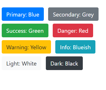
Provide Feedback For This Article
We take your feedback seriously and use it to improve our content. Thank you for helping us serve you better!
😊 Thanks for your time, your feedback has been registered!
Comments & Discussion
Facing issues? Have questions? Post them here! We're happy to help!