
Mouse Cursors may vary depending upon what operating system you are using (macOS, Windows, or Unix flavors) as well as the Browser type and version (Chrome, Safari, Firefox, Opera). But do you know as a web developer that there are about 32+ websafe mouse cursor options that are available in CSS that you can use for your website? The CSS property name is the cursor.
Let's see each of the 32 Different cursor types we have
- Default Cursor :
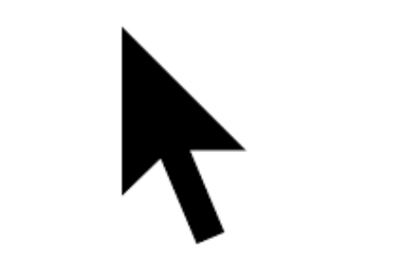
The default cursor is the normal cursor that you see, depending on the operating system it may differ (for Google Chrome, Mac OS X has a pointer arrow that's black with a white border, whereas on Windows 8 the cursor is white with black border). If you want to use this cursor type then use cursor:default in the style of the element.
- Best used for General interface elements
- When to use: For most non-interactive elements on your page
- Do: Use for standard, non-clickable content
- Don't: Use for elements that have specific actions or interactions
- Auto Cursor :

This kind of cursor is determined by the UA (User-Agent) depending upon the content on which the mouse is currently. The web browser determines the cursor to display based on the current context. E.g. equivalent to text when hovering text.
- Best used for: General purpose cursor
- When to use: When you want the browser to decide the appropriate cursor
- Do: Use when you're unsure which cursor type to use
- Don't: Use when you need a specific cursor for a particular interaction
- Crosshair Cursor :

You will see a cross kind of pointer when you use this type of cursor, this cursor type is usually used when you have to crop some image. cursor:crosshair is the CSS property that you must use.
- Best used for: Precise selection or drawing tools
- When to use: Image editing interfaces, drawing applications
- Do: Use for tools requiring precise pixel-level interactions
- Don't: Use for general navigation or clickable elements
- Move Cursor :

This type of cursor is usually used when you want to drag/move something on a webpage, say you have an avatar image that the user can move to fit the exact portion of the image he/she wants to be in the frame. It looks similar to a cross-hair cursor, except that it has arrows at all four ends. The CSS property for this is cursor:move.
- Best used for: Draggable elements
- When to use: For elements that can be moved around the interface
- Do: Use for drag-and-drop interfaces, movable windows or elements
- Don't: Use for elements that aren't movable
- Pointer Cursor :

This cursor looks like a hand with a pointing finger (on the Mac OS X it's a hand with a white glove on it seems :D), this cursor is usually displayed when you have a hyperlink. When you hover over any link on a page you will see this cursor to indicate that it is a hyperlink.
- Best used for: Clickable elements
- When to use: For links, buttons, and other interactive elements
- Do: Use to indicate clickable or interactive elements
- Don't: Use for non-clickable text or images
- Text Cursor :

This cursor is usually displayed when you hover over some text content on the page, it is usually displayed as an I-beam indication to the user that the text can be selected (any yes copied to clipboard)
- Best used for Editable text fields
- When to use: For input fields, text areas, and editable content
- Do: Use for any area where text can be input or selected
- Don't: Use for non-editable text or other non-text elements
- Wait Cursor :

This cursor is displayed when the page is waiting for some resource to get loaded. This is displayed as an hourglass on Windows OS and as a colorful circular spinning pinwheel.
- Best used for: Loading states
- When to use: When the system is processing a request and user must wait
- Do: Use during loading or processing operations
- Don't: Use for extended periods without providing feedback
- Help Cursor :

This cursor is displayed as a question mark or a balloon. When displayed it indicates that help is available for the content.
- Best used for: Help or information elements
- When to use: For elements that provide additional information or help
- Do: Use for tooltips, help icons, or contextual help elements
- Don't: Use for standard clickable elements or navigation
- Progress Cursor:

This may look similar to waiting for cursor, but it's different as it is used to indicate the progress of something. It is usually displayed as an animated spinning beach ball or a pinwheel or an arrow with a watch or an hourglass.
- Best used for: Ongoing processes
- When to use: For operations that take time but allow some interaction
- Do: Use for background processes or loading that don't block interaction
- Don't: Use for completely blocked states (use wait cursor instead)
- e-resize Cursor

This cursor is an Indicator that you can resize or move something in the East direction of the Screen. It is an arrow pointing toward the east direction.
- Best used for: Horizontal resizing (right edge)
- When to use: For elements that can be resized horizontally from the right edge
- Do: Use for right edges of resizable elements
- Don't: Use for vertical resizing or non-resizable elements
- w-resize Cursor

This cursor is an Indicator that you can resize or move something in the West direction of the Screen. It is an arrow pointing toward the west direction.
- Best used for: Horizontal resizing (left edge)
- When to use: For elements that can be resized horizontally from the left edge
- Do: Use for left edges of resizable elements
- Don't: Use for vertical resizing or non-resizable elements
- s-resize Cursor
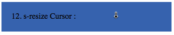
This cursor is an Indicator that you can resize or move something in the South direction of the Screen. Its an arrow pointing towards the south direction.
- Best used for: Vertical resizing (bottom edge)
- When to use: For elements that can be resized vertically from the bottom edge
- Do: Use for bottom edges of resizable elements
- Don't: Use for horizontal resizing or non-resizable elements
- n-resize Cursor

This cursor is an Indicator that you can resize or move something in the North direction of the Screen. It is an arrow pointing toward the north direction.
- Best used for: Vertical resizing (top edge)
- When to use: For elements that can be resized vertically from the top edge
- Do: Use for top edges of resizable elements
- Don't: Use for horizontal resizing or non-resizable elements
- ne-resize Cursor

This cursor is an Indicator that you can resize or move something in the North-East direction of the Screen. It is an arrow pointing towards the north-east direction.
- Best used for: Diagonal resizing (top-right corner)
- When to use: For elements that can be resized diagonally from the top-right corner
- Do: Use for top-right corners of resizable elements
- Don't: Use for other directions or non-resizable elements
- nw-resize Cursor

This cursor is an Indicator that you can resize or move something in the North-West direction of the Screen. It is an arrow pointing towards the north-west direction.
- Best used for: Diagonal resizing (top-left corner)
- When to use: For elements that can be resized diagonally from the top-left corner
- Do: Use for top-left corners of resizable elements
- Don't: Use for other directions or non-resizable elements
- se-resize Cursor

This cursor is an Indicator that you can resize or move something in the South-East direction of the Screen. It is an arrow pointing towards the South-East direction.
- Best used for: Diagonal resizing (bottom-right corner)
- When to use: For elements that can be resized diagonally from the bottom-right corner
- Do: Use for bottom-right corners of resizable elements
- Don't: Use for other directions or non-resizable elements
- sw-resize Cursor
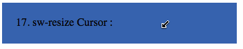
This cursor is an Indicator that you can resize or move something in the Southwest direction of the Screen. It is an arrow pointing towards the South-West direction.
- Best used for: Diagonal resizing (bottom-left corner)
- When to use: For elements that can be resized diagonally from the bottom-left corner
- Do: Use for bottom-left corners of resizable elements
- Don't: Use for other directions or non-resizable elements
- not-allowed Cursor :

This cursor is displayed on objects where some operations like copy, move, drag, or drop are not allowed, it is usually displayed as an arrow having a circle with a stroke.
- Best used for: Disabled or unavailable actions
- When to use: For elements or actions that are currently not available or permitted
- Do: Use to indicate that an action cannot be performed
- Don't: Use for elements that are clickable or interactive
- no-drop Cursor :
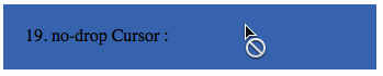
This cursor is displayed when the drop feature is not allowed on an object. It may look similar to the not allowed cursor type.
- Best used for: Invalid drop targets in drag-and-drop interfaces
- When to use: When dragging an item over an area where it cannot be dropped
- Do: Use in drag-and-drop interfaces to indicate invalid drop zones
- Don't: Use for general unavailable actions (use not-allowed instead)
- vertical-text Cursor :
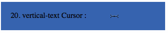
This looks similar to text cursor except it displays the I-beam horizontally to indicate that the text that is displayed horizontally can be selected.
- Best used for: Vertical text input or selection
- When to use: For areas with vertical text that can be edited or selected
- Do: Use for vertical text input fields or selectable vertical text
- Don't: Use for horizontal text or non-text elements
- all-scroll Cursor :

This cursor indicates that scrolling in all directions is possible, usually displayed when you click on the mouse wheel button, indicates that you can move the mouse in all directions and the page will scroll in that direction.
- Best used for: Scrollable content in any direction
- When to use: For elements that can be scrolled both horizontally and vertically
- Do: Use for map interfaces or large scrollable areas
- Don't: Use for elements that only scroll in one direction
- Column resize Cursor :
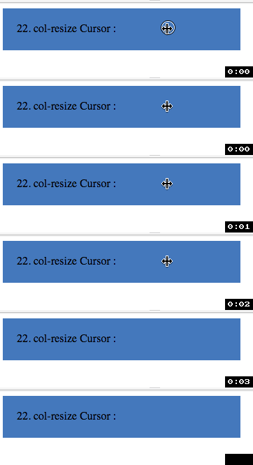
This cursor indicates that a particular column is re-sizable, usually displayed when you place the cursor at the edge of the column.
- Best used for: Resizable table columns
- When to use: For the edges of columns that can be resized
- Do: Use in table interfaces where column widths are adjustable
- Don't: Use for row resizing or non-resizable columns
- Row resize :

This is similar to Column resize Cursor but used to indicate that the row is re-sizable.
- Best used for: Resizable table rows
- When to use: For the edges of rows that can be resized
- Do: Use in table interfaces where row heights are adjustable
- Don't: Use for column resizing or non-resizable rows
- URL Cursor :

This cursor doesn't seem to work on Mac OS X, it is used to display images along with the cursor pointer.
- Best used for: Custom cursors
- When to use: When you want to use a custom image as the cursor
- Do: Use for unique, branded cursor experiences
- Don't: Overuse or use in a way that hinders usability
- Grab Cursor

This cursor indicates that something can be grabbed.
- Best used for: Draggable elements (before grabbing)
- When to use: For elements that can be clicked and dragged
- Do: Use to indicate that an element is draggable
- Don't: Use for elements that are not draggable
- Grabbing Cursor

This cursor indicates that something is being grabbed.
- Best used for: Draggable elements (while grabbing)
- When to use: When the user is actively dragging an element
- Do: Use while an element is being dragged
- Don't: Use for elements that are not currently being dragged
- Zoom in Cursor :

This indicates that Zoom-in option is available or activated for an element like an image on a webpage. It is displayed as a magnifying glass with a plus + sign.
- Best used for: Zoomable content (zooming in)
- When to use: For elements that can be zoomed in or areas where zooming in is possible
- Do: Use on zoomable images or map interfaces
- Don't: Use for non-zoomable content
- Zoom out Cursor :

This indicates that Zoom out option is available or activated for an element like an image on a webpage. It is displayed as a magnifying glass with a minus - sign.
- Best used for: Zoomable content (zooming out)
- When to use: For elements that can be zoomed out or areas where zooming out is possible
- Do: Use on zoomable images or map interfaces when zoomed in
- Don't: Use for non-zoomable content or when already at minimum zoom level
- Cell Cursor :

This cursor is displayed as a thick + symbol (the one you see in excel sheets) it indicates that cells can be selected.
- Best used for: Spreadsheet-like interfaces
- When to use: For grid-based layouts where individual cells can be selected
- Do: Use in table or spreadsheet interfaces
- Don't: Use for general purpose selection or clicking
- Alias Cursor :

This cursor type indicates an alias or shortcut is to be created.
- Best used for: Creating shortcuts or aliases
- When to use: When the user can create a shortcut or alias of an item
- Do: Use in file management interfaces for creating shortcuts
- Don't: Use for general linking or copying actions
- Copy Cursor :

It indicates that the current object can be copied. It is displayed as a green circle with a plus sign on the Mac OS X.
- Best used for: Copyable elements
- When to use: When hovering over elements that can be copied
- Do: Use to indicate that an element can be duplicated or copied
- Don't: Use for elements that cannot be copied or for other actions like moving
- Context Menu Cursor :

It indicates that a context menu is available under the cursor. Note on Windows it is available on ie10 or above.
- Best used for: Elements with context menus
- When to use: For areas where right-clicking will open a context menu
- Do: Use to indicate the availability of a context menu
- Don't: Use for elements without context menus or on unsupported browsers
Provide Feedback For This Article
We take your feedback seriously and use it to improve our content. Thank you for helping us serve you better!
😊 Thanks for your time, your feedback has been registered!
Comments & Discussion
Facing issues? Have questions? Post them here! We're happy to help!