
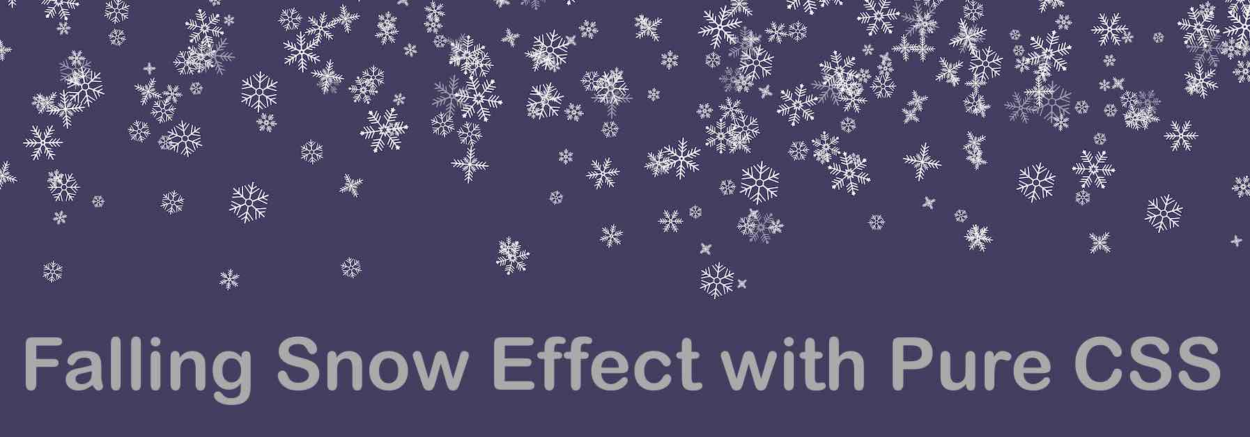
It's winter and it's Christmas! If you are looking for some change on your website to show your visitors some joy of the festive show! Well, you can do that by just using some CSS.
Firstly to create you will require some snowflakes! Well there are a few Unicodes that you give all kinds of snowflakes.
Showflakes Unicodes List
- Snowflake : U+2746: ❄
- Tight Trifoliate Snowflake: U+2746: ❅
- Heavy Chevron Snowflake: U+2746: ❆
Now all you need to do is create div elements and set these snowflakes at random,
<div class="snowflakes" aria-hidden="true">
  <div class="snowflake size3">❅</div>
  <div class="snowflake size1">❆</div>
  <div class="snowflake size2">❅</div>
  <div class="snowflake size3">❆</div>
  <div class="snowflake size4">❅</div>
  <div class="snowflake size5">❆</div>
  <div class="snowflake size1">❅</div>
  <div class="snowflake size1">❆</div>
  <div class="snowflake size2">❅</div>
  <div class="snowflake size3">❆</div>
  <div class="snowflake size4">❅</div>
  <div class="snowflake size5">❆</div>
</div>
And next make use of the below CSS Code (Source: https://github.com/pajasevi/CSSnowflakes)
<style>
  .snowflake {
    color: #fff;
    font-size: 12px;
    font-family: Arial, sans-serif;
    text-shadow: 0 0 5px #000;
  }

.size1 {
font-size: 10px;
}

.size1 {
font-size: 14px;
}

.size1 {
font-size: 16px;
}

.size1 {
font-size: 18px;
}

.size1 {
font-size: 20px;
}

  @-webkit-keyframes snowflakes-fall {
    0% {
      top: -10%
    }

    100% {
      top: 100%
    }
  }

  @-webkit-keyframes snowflakes-shake {

    0%,
    100% {
      -webkit-transform: translateX(0);
      transform: translateX(0)
    }

    50% {
      -webkit-transform: translateX(80px);
      transform: translateX(80px)
    }
  }

  @keyframes snowflakes-fall {
    0% {
      top: -10%
    }

    100% {
      top: 100%
    }
  }

  @keyframes snowflakes-shake {

    0%,
    100% {
      transform: translateX(0)
    }

    50% {
      transform: translateX(80px)
    }
  }

  .snowflake {
    position: fixed;
    top: -10%;
    z-index: 9999;
    -webkit-user-select: none;
    -moz-user-select: none;
    -ms-user-select: none;
    user-select: none;
    cursor: default;
    -webkit-animation-name: snowflakes-fall, snowflakes-shake;
    -webkit-animation-duration: 10s, 3s;
    -webkit-animation-timing-function: linear, ease-in-out;
    -webkit-animation-iteration-count: infinite, infinite;
    -webkit-animation-play-state: running, running;
    animation-name: snowflakes-fall, snowflakes-shake;
    animation-duration: 10s, 3s;
    animation-timing-function: linear, ease-in-out;
    animation-iteration-count: infinite, infinite;
    animation-play-state: running, running
  }

  .snowflake:nth-of-type(0) {
    left: 1%;
    -webkit-animation-delay: 0s, 0s;
    animation-delay: 0s, 0s
  }

  .snowflake:nth-of-type(1) {
    left: 10%;
    -webkit-animation-delay: 1s, 1s;
    animation-delay: 1s, 1s
  }

  .snowflake:nth-of-type(2) {
    left: 20%;
    -webkit-animation-delay: 6s, .5s;
    animation-delay: 6s, .5s
  }

  .snowflake:nth-of-type(3) {
    left: 30%;
    -webkit-animation-delay: 4s, 2s;
    animation-delay: 4s, 2s
  }

  .snowflake:nth-of-type(4) {
    left: 40%;
    -webkit-animation-delay: 2s, 2s;
    animation-delay: 2s, 2s
  }

  .snowflake:nth-of-type(5) {
    left: 50%;
    -webkit-animation-delay: 8s, 3s;
    animation-delay: 8s, 3s
  }

  .snowflake:nth-of-type(6) {
    left: 60%;
    -webkit-animation-delay: 6s, 2s;
    animation-delay: 6s, 2s
  }

  .snowflake:nth-of-type(7) {
    left: 70%;
    -webkit-animation-delay: 2.5s, 1s;
    animation-delay: 2.5s, 1s
  }

  .snowflake:nth-of-type(8) {
    left: 80%;
    -webkit-animation-delay: 1s, 0s;
    animation-delay: 1s, 0s
  }

  .snowflake:nth-of-type(9) {
    left: 90%;
    -webkit-animation-delay: 3s, 1.5s;
    animation-delay: 3s, 1.5s
  }

  .snowflake:nth-of-type(10) {
    left: 25%;
    -webkit-animation-delay: 2s, 0s;
    animation-delay: 2s, 0s
  }

  .snowflake:nth-of-type(11) {
    left: 65%;
    -webkit-animation-delay: 4s, 2.5s;
    animation-delay: 4s, 2.5s
  }

</style>

<!-- The MIT License (MIT)

Copyright (c) 2014 Pavel Ševčík

Permission is hereby granted, free of charge, to any person obtaining a copy
of this software and associated documentation files (the "Software"), to deal
in the Software without restriction, including without limitation the rights
to use, copy, modify, merge, publish, distribute, sublicense, and/or sell
copies of the Software, and to permit persons to whom the Software is
furnished to do so, subject to the following conditions:

The above copyright notice and this permission notice shall be included in all
copies or substantial portions of the Software.

THE SOFTWARE IS PROVIDED "AS IS", WITHOUT WARRANTY OF ANY KIND, EXPRESS OR
IMPLIED, INCLUDING BUT NOT LIMITED TO THE WARRANTIES OF MERCHANTABILITY,
FITNESS FOR A PARTICULAR PURPOSE AND NONINFRINGEMENT. IN NO EVENT SHALL THE
AUTHORS OR COPYRIGHT HOLDERS BE LIABLE FOR ANY CLAIM, DAMAGES OR OTHER
LIABILITY, WHETHER IN AN ACTION OF CONTRACT, TORT OR OTHERWISE, ARISING FROM,
OUT OF OR IN CONNECTION WITH THE SOFTWARE OR THE USE OR OTHER DEALINGS IN THE
SOFTWARE. -->
This should set the falling show effect on your webpage as you should see on this page!
Happy Holidays!
Provide Feedback For This Article
We take your feedback seriously and use it to improve our content. Thank you for helping us serve you better!
😊 Thanks for your time, your feedback has been registered!
Comments & Discussion
Facing issues? Have questions? Post them here! We're happy to help!