
Table of Contents
- Circular Profile Picture (Basic)
- Squared Profile Picture with Rounded Corners
- Hexagonal Profile Picture
- Profile Picture with Hover Overlay
- Polaroid-style Profile Picture
- Profile Picture with Glowing Border
- Tilted Profile Picture
- Profile Picture with Custom Shape (Star)
- Profile Picture with Grayscale Effect and Color on Hover
- Profile Picture with 3D Flip Effect
- Profile Picture with Pulsating Border
- Profile Picture with Rotating Frame
In this tutorial, we'll explore 12 different profile picture designs using CSS. Each design comes with step-by-step instructions and code that you can easily copy and use in your projects.
1. Circular Profile Picture (Basic)
This is a simple circular profile picture design. Here's how to implement it:
HTML:
<div class="profile-picture circular">
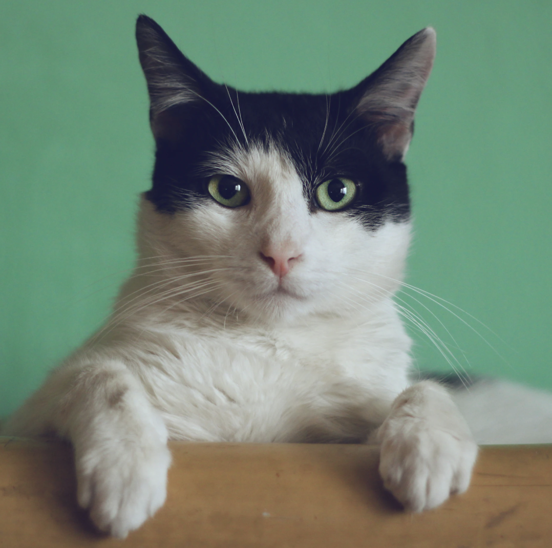
<img src="images/cat-profile-picture.png" alt="Cat Profile">
</div>CSS:
.profile-picture.circular {
  width: 200px;
  height: 200px;
  border-radius: 50%;
  overflow: hidden;
}

.profile-picture.circular img {
  width: 100%;
  height: 100%;
  object-fit: cover;
}
2. Squared Profile Picture with Rounded Corners
This design features a squared profile picture with rounded corners:
HTML:
<div class="profile-picture squared">
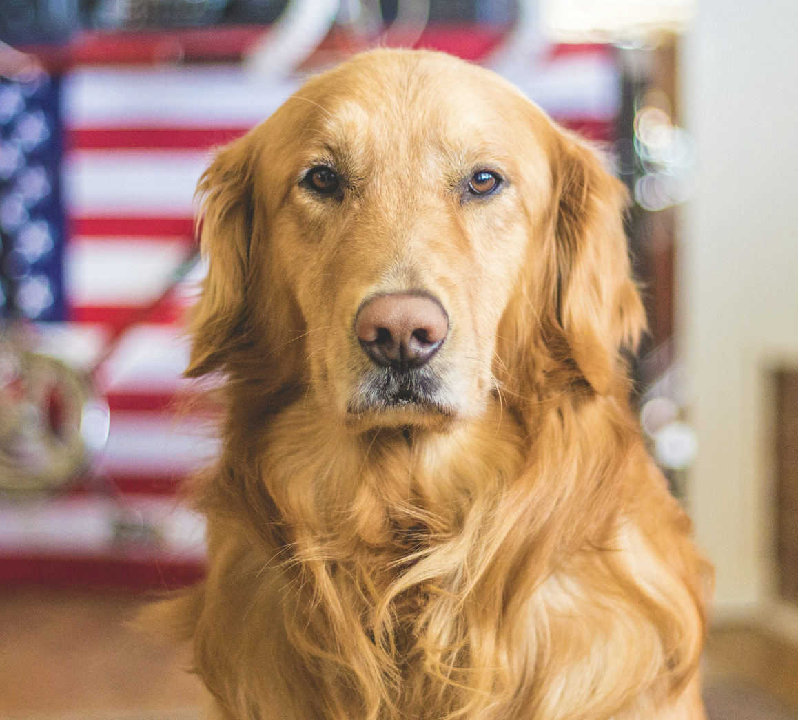
<img src="images/dog-profile-picture.png" alt="Dog Profile">
</div>CSS:
.profile-picture.squared {
  width: 200px;
  height: 200px;
  border-radius: 20px;
  overflow: hidden;
}

.profile-picture.squared img {
  width: 100%;
  height: 100%;
  object-fit: cover;
}
3. Hexagonal Profile Picture
Create a hexagonal profile picture using CSS clip-path:
HTML:
<div class="profile-picture hexagon">
  <img src="images/cat-profile-picture.png" alt="Cat Profile">
</div>
CSS:
.profile-picture.hexagon {
  width: 200px;
  height: 230px;
  clip-path: polygon(50% 0%, 100% 25%, 100% 75%, 50% 100%, 0% 75%, 0% 25%);
  overflow: hidden;
}

.profile-picture.hexagon img {
  width: 100%;
  height: 100%;
  object-fit: cover;
}
4. Profile Picture with Hover Overlay
Add an overlay effect that appears on hover:
HTML:
<div class="profile-picture overlay">
  <img src="images/dog-profile-picture.png" alt="Dog Profile">
  <div class="overlay-content">Hello!</div>
</div>
CSS:
.profile-picture.overlay {
  width: 200px;
  height: 200px;
  border-radius: 50%;
  overflow: hidden;
  position: relative;
}

.profile-picture.overlay img {
  width: 100%;
  height: 100%;
  object-fit: cover;
}

.profile-picture.overlay .overlay-content {
  position: absolute;
  top: 0;
  left: 0;
  width: 100%;
  height: 100%;
  background-color: rgba(0, 0, 0, 0.7);
  color: white;
  display: flex;
  justify-content: center;
  align-items: center;
  opacity: 0;
  transition: opacity 0.3s ease;
}

.profile-picture.overlay:hover .overlay-content {
  opacity: 1;
}
5. Polaroid-style Profile Picture
Create a Polaroid-style frame for your profile picture:
HTML:
<div class="profile-picture polaroid">
  <img src="images/cat-profile-picture.png" alt="Cat Profile">
  <div class="caption">Meow!</div>
</div>
CSS:
.profile-picture.polaroid {
  width: 220px;
  padding: 10px 10px 20px 10px;
  background-color: white;
  box-shadow: 0 4px 8px rgba(0, 0, 0, 0.1);
}

.profile-picture.polaroid img {
  width: 100%;
  height: 200px;
  object-fit: cover;
}

.profile-picture.polaroid .caption {
  text-align: center;
  margin-top: 10px;
}
6. Profile Picture with Glowing Border
Add a colorful glowing border to your profile picture:
HTML:
<div class="profile-picture glowing">
  <img src="images/dog-profile-picture.png" alt="Dog Profile">
</div>
CSS:
.profile-picture.glowing {
  width: 200px;
  height: 200px;
  border-radius: 50%;
  overflow: hidden;
  position: relative;
}

.profile-picture.glowing::before {
  content: '';
  position: absolute;
  top: -2px;
  left: -2px;
  right: -2px;
  bottom: -2px;
  background: linear-gradient(45deg, #ff0000, #ff7300, #fffb00, #48ff00, #00ffd5, #002bff, #7a00ff, #ff00c8, #ff0000);
  z-index: -1;
  filter: blur(5px);
  animation: glowing 20s linear infinite;
}

.profile-picture.glowing img {
    width: 100%;
  height: 100%;
  object-fit: cover;
}

@keyframes glowing {
  0% { background-position: 0 0; }
  50% { background-position: 400% 0; }
  100% { background-position: 0 0; }
}
7. Tilted Profile Picture
Create a slightly tilted profile picture for a playful look:
HTML:
<div class="profile-picture tilted">
  <img src="images/cat-profile-picture.png" alt="Cat Profile">
</div>
CSS:
.profile-picture.tilted {
  width: 200px;
  height: 200px;
  transform: rotate(-5deg);
  overflow: hidden;
  box-shadow: 0 4px 8px rgba(0, 0, 0, 0.1);
}

.profile-picture.tilted img {
  width: 100%;
  height: 100%;
  object-fit: cover;
  transform: rotate(5deg) scale(1.2);
}
8. Profile Picture with Custom Shape (Star)
Create a star-shaped profile picture using CSS clip-path:
HTML:
<div class="profile-picture star">
  <img src="images/dog-profile-picture.png" alt="Dog Profile">
</div>
CSS:
.profile-picture.star {
  width: 200px;
  height: 200px;
  clip-path: polygon(50% 0%, 61% 35%, 98% 35%, 68% 57%, 79% 91%, 50% 70%, 21% 91%, 32% 57%, 2% 35%, 39% 35%);
  overflow: hidden;
}

.profile-picture.star img {
  width: 100%;
  height: 100%;
  object-fit: cover;
}
9. Profile Picture with Grayscale Effect and Color on Hover
Apply a grayscale filter to the profile picture and reveal color on hover:
HTML:
<div class="profile-picture grayscale">
  <img src="images/cat-profile-picture.png" alt="Cat Profile">
</div>
CSS:
.profile-picture.grayscale {
  width: 200px;
  height: 200px;
  border-radius: 50%;
  overflow: hidden;
}

.profile-picture.grayscale img {
  width: 100%;
  height: 100%;
  object-fit: cover;
  filter: grayscale(100%);
  transition: filter 0.3s ease;
}

.profile-picture.grayscale:hover img {
  filter: grayscale(0%);
}
10. Profile Picture with 3D Flip Effect
Woof!
Create a 3D flip effect for your profile picture:
HTML:
<div class="profile-picture flip">
  <div class="flipper">
    <div class="front">
      <img src="images/dog-profile-picture.png" alt="Dog Profile">
    </div>
    <div class="back">
      <p>Woof!</p>
    </div>
  </div>
</div>
CSS:
.profile-picture.flip {
  width: 200px;
  height: 200px;
  perspective: 1000px;
}

.profile-picture.flip .flipper {
  width: 100%;
  height: 100%;
  position: relative;
  transition: transform 0.8s;
  transform-style: preserve-3d;
}

.profile-picture.flip:hover .flipper {
  transform: rotateY(180deg);
}

.profile-picture.flip .front,
.profile-picture.flip .back {
  position: absolute;
  width: 100%;
  height: 100%;
  backface-visibility: hidden;
  border-radius: 50%;
  overflow: hidden;
}

.profile-picture.flip .front img {
  width: 100%;
  height: 100%;
  object-fit: cover;
}

.profile-picture.flip .back {
  background-color: #3498db;
  color: white;
  display: flex;
  justify-content: center;
  align-items: center;
  transform: rotateY(180deg);
}
11. Profile Picture with Pulsating Border
Create a profile picture with a pulsating border effect:
HTML:
<div class="profile-picture pulsating">
  <img src="images/cat-profile-picture.png" alt="Cat Profile">
</div>
CSS:
.profile-picture.pulsating {
  width: 200px;
  height: 200px;
  border-radius: 50%;
  overflow: hidden;
  position: relative;
}
.profile-picture.pulsating::before {
  content: '';
  position: absolute;
  top: -2px;
  left: -2px;
  right: -2px;
  bottom: -2px;
  border-radius: 50%;
  background: #3498db;
  z-index: -1;
  animation: pulse 1.5s ease-out infinite;
}
.profile-picture.pulsating img {
  width: 100%;
  height: 100%;
  object-fit: cover;
}
@keyframes pulse {
  0% { transform: scale(1); opacity: 1; }
  50% { transform: scale(1.05); opacity: 0.7; }
  100% { transform: scale(1); opacity: 1; }
}
12. Profile Picture with Rotating Frame
Create a profile picture with a rotating frame effect:
HTML:
<div class="profile-picture rotating-frame">
  <img src="images/dog-profile-picture.png" alt="Dog Profile">
</div>
CSS:
.profile-picture.rotating-frame {
  width: 200px;
  height: 200px;
  border-radius: 50%;
  position: relative;
  overflow: hidden;
}
.profile-picture.rotating-frame::before {
  content: '';
  position: absolute;
  top: -50%;
  left: -50%;
  width: 200%;
  height: 200%;
  background: conic-gradient(from 0deg, transparent 0deg 45deg, #3498db 45deg 135deg, transparent 135deg 225deg, #3498db 225deg 315deg, transparent 315deg 360deg);
  animation: rotate 10s linear infinite;
}
.profile-picture.rotating-frame img {
  position: absolute;
  top: 5px;
  left: 5px;
  width: calc(100% - 10px);
  height: calc(100% - 10px);
  border-radius: 50%;
  object-fit: cover;
}
@keyframes rotate {
  0% { transform: rotate(0deg); }
  100% { transform: rotate(360deg); }
}
Conclusion
These 12 profile picture designs showcase the versatility of CSS in creating unique and engaging user interfaces. Feel free to use these designs as-is or as inspiration for your own creative profile picture styles. Remember to replace the image sources with your own profile pictures when implementing these designs in your projects.
Provide Feedback For This Article
We take your feedback seriously and use it to improve our content. Thank you for helping us serve you better!
😊 Thanks for your time, your feedback has been registered!
Comments & Discussion
Facing issues? Have questions? Post them here! We're happy to help!