What are Media Queries?
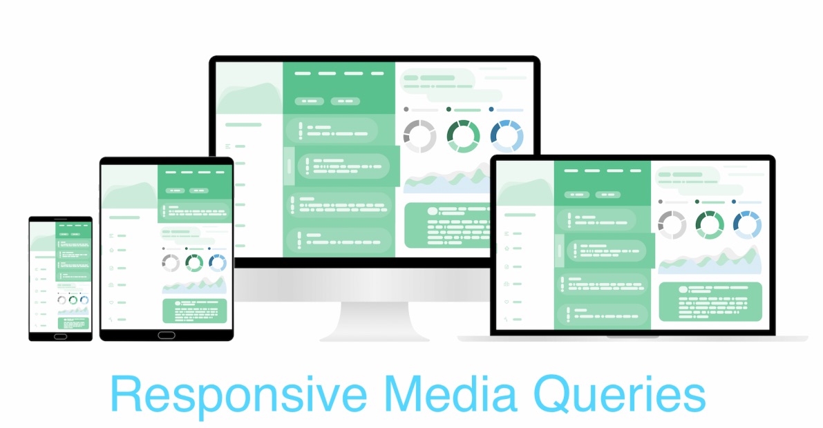
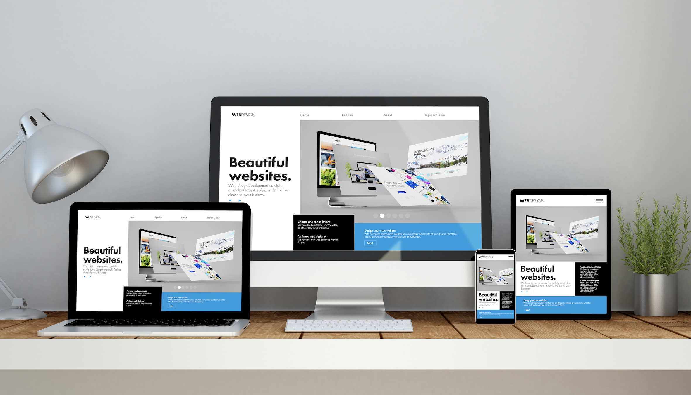
Media queries (@media) are a crucial component of Responsive Web Design (RWD) using CSS3. They enable web content to adapt to various screen sizes across multiple devices, including desktops, laptops, mobiles, tablets, and even TVs. With the continuous rise of mobile browsing, optimizing your website for different devices is essential to ensure a seamless user experience in 2023 and beyond.
Facts! Did you know? Media query was initially proposed in 1994 and became a part of the W3C recommended standard in the year 2012.
What is @media?
The "@media" is called the "at-rule", and is the rule that determines how to display or hide CSS blocks based on specific rules you define. For instance, if your screen width falls between 320px to 785px, the CSS in the 320px block will be displayed. If the screen width is greater than or equal to 786px, the selectors in Block B will be shown instead. The goal is to apply CSS styles according to screen size conditions.
@media (min-width: 320px) { //Block A
    //selectors

} @media (min-width: 786px) { //Block B
    //selectors

}
Using Logical Operators: and, not and only
What we saw in the above example was a simple query, you may want to display the same CSS selectors based on conditions like "If the screen size is 480px". Here screen refers to devices that have a screen, you any also design your CSS or printers by using print
@media screen (min-width: 320px) { //Block A
    //selectors

}
The and logical operators can be used the way we use them programmatically to compile multiple conditions into a single condition, so if you have to render the same CSS selectors for a range of screen width you can use it as below,
@media (min-width: 700px) and (max-width: 1200px) {
    //selectors
}
The not operator can be used in media queries to negate a rule. It's not widely used though and should be avoided.
The or operator is and comma here, let's see an example: if the screen size is 700px or 1200px ally the selectors,
@media (min-width: 700px),(max-width: 1200px) {
    //selectors
}
Now that we know what are media queries, we need to know all the screen sizes we need to take care of, you might need to do some research, listing down a few of the important screen sizes,
- Small screen Mobile : 320px
- Medium screen Mobile : 480px
- Large screen Mobile/Tablets : 680px
- Mobile/Tablets : 800px
- Laptops/Desktops :960px
- Laptops/Desktops :1024px
- Desktops/Tv : 1920px
⚠️ Remember that mobile screens have landscape and portrait modes, we need to take care of those sizes as well!
So let's see how our media query framework would look like for these devices in mind,
CSS Media Queries Template 2023
Below is the common screen resolutions based on the stats of user browsing the web across the globe as of 2023
Source: StatCounter Global Stats - Screen Resolution Market Share

| Browser Screen Resolution | Device Type | % Share |
|---|---|---|
| 1920x1080 | Desktop/Laptops | 9.3% |
| 360x800 | iPhone/Android Mobile Phones | 7.3% |
| 1366x768 | Desktop/Laptops | 6.2% |
| 1536x864 | Desktop/Laptops | 4.2% |
| 390x844 | iPhone/Android Mobile Phones | 4.0% |
| 414x896 | iPhone/Android Mobile Phones | 3.5% |
    @media only screen and (min-width : 320px) {
    //selectors
}
    @media only screen and (min-width : 480px) {
    //selectors
}
}
    /* Mobile phones/Tablets/Phablets ------- */
    @media only screen and (min-width : 600px) {
    //selectors
}
    /* Tablets/Phablets ----------- */
    @media only screen and (min-width : 800px) {
    //selectors
}
    /* Desktop/Laptops ----------- */
    @media only screen and (min-width : 1024px) {
    //selectors
}
    /* Desktop/Laptops ----------- */
    @media only screen and (min-width : 1200px) {
    //selectors
}
Media Query HTML CSS3 Example:
<!DOCTYPE html PUBLIC "-//W3C//DTD HTML 4.01 Transitional//EN"
 "http://www.w3.org/TR/html4/loose.dtd">
<html>
<head>
<title>Responsive web design using CSS Media Queries :
	Code2care.org</title>
<meta http-equiv="Content-Type" content="text/html; charset=ISO-8859-1">
<script class="jsbin" src="https://ajax.googleapis.com/ajax/libs/jquery/1/jquery.min.js"></script>
<style>

/* For browsers that don't support media queries */
* {
	margin: 0 auto
}

.background {
	margin-top: 20px;
	background-color: #bbb;
	padding: 15px;
	width: 900px;
	min-height: 800px;
}

.block2 {
	padding: 15px;
	background-color: yellow;
	height: 500px;
	width: 240px;
	float: right;
}

.block1 {
	padding: 15px;
	background-color: green;
	height: 500px;
	width: 600px;
	float: left;
}

.image {
	margin-top: 50px;
	margin-left: 120px;
	width: 50%;
}

#widthbox {
	width: 100px;
	background-color: #222;
	color: #fff;
	margin-left: 5px;
	text-align: center;
}

/* Mobile phones like iPhone */
@media only screen and (min-width : 320px) {
	* {
		margin: 0 auto
	}
	.background {
		margin-top: 20px;
		background-color: #bbb;
		padding: 15px;
		width: 310px;
		min-height: 800px;
	}
	.block2 {
		padding: 15px;
		background-color: yellow;
		height: 300px;
		width: 280px;
		float: right;
	}
	.block1 {
		padding: 15px;
		background-color: green;
		height: 350px;
		width: 280px;
		float: right;
	}
	#size {
		width: 100px;
		background-color: #222;
		color: #fff;
		margin-left: 5px;
		text-align: center;
	}
	.image {
		margin-top: 20px;
		margin-left: 80px;
		width: 45%;
	}
}

/* Mobile phones with larger screen */
@media only screen and (min-width : 480px) {
	.background {
		width: 460px;
	}
	.block2 {
		background-color: yellow;
		width: 430px;
		height: 300px;
		float: right;
	}
	.block1 {
		background-color: green;
		width: 430px;
		height: 350px;
		float: right;
	}
	.image {
		margin-top: 20px;
		margin-left: 120px;
		width: 40%;
	}
}

}
/* Mobile phones in Portrait view/Tablets/Phablets */
@media only screen and (min-width : 600px) {
	.background {
		width: 580px;
	}
	.block2 {
		background-color: yellow;
		width: 540px;
		float: right;
	}
	.block1 {
		background-color: green;
		width: 540px;
		float: right;
	}
}

/* Tablets/Phablets */
@media only screen and (min-width : 800px) {
	.background {
		width: 780px;
	}
	.block2 {
		background-color: yellow;
		width: 240px;
		height: 400px;
		float: right;
	}
	.block1 {
		background-color: green;
		width: 480px;
		height: 400px;
		float: left;
	}
}

/* Desktop/Laptops */
@media only screen and (min-width : 1024px) {
	.background {
		width: 1000px;
	}
	.block2 {
		background-color: yellow;
		width: 240px;
		height: 400px;
		float: right;
	}
	.block1 {
		background-color: green;
		width: 700px;
		height: 400px;
		float: left;
	}
	.image {
		margin-top: 50px;
		margin-left: 120px;
		width: 40%;
	}
}

/* Desktop/Laptops ----------- */
@media only screen and (min-width : 1200px) {
	.background {
		width: 1200px;
	}
	.block2 {
		background-color: yellow;
		width: 480px;
		height: 500px;
		float: right;
	}
	.block1 {
		background-color: green;
		width: 660px;
		height: 500px;
		float: left;
	}
	.image {
		margin-top: 50px;
		margin-left: 120px;
		width: 50%;
	}
}
}
</style>
</head>
<body>
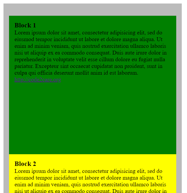
<div class="background">
<div id="widthbox"></div>
<br>
<div class="block1">
<h3>Block 1</h3>
Lorem ipsum dolor sit amet, consectetur adipisicing elit, sed do
eiusmod tempor incididunt ut labore et dolore magna aliqua. Ut enim
ad minim veniam, quis nostrud exercitation ullamco laboris nisi ut
aliquip ex ea commodo consequat. Duis aute irure dolor in
reprehenderit in voluptate velit esse cillum dolore eu fugiat nulla
pariatur. Excepteur sint occaecat cupidatat non proident, sunt in
culpa qui officia deserunt mollit anim id est laborum.
<div>
<img class="image" src="images/test_image.jpg" />
</div>
</div>
<div class="block2">
<h3>Block 2</h3>
Lorem ipsum dolor sit amet, consectetur adipisicing elit, sed do
eiusmod tempor incididunt ut labore et dolore magna aliqua. Ut enim
ad minim veniam, quis nostrud exercitation ullamco laboris nisi ut
aliquip ex ea commodo consequat. Duis aute irure dolor in
reprehenderit in voluptate velit esse cillum dolore eu fugiat nulla
pariatur. Excepteur sint occaecat cupidatat non proident, sunt in
culpa qui officia deserunt mollit anim id est laborum.
</div>
</div>
<script type="text/javascript">
	$("#widthbox").text("Width : " + $(window).width());

	$(window).resize(function() {
		$("#widthbox").text("Width :  " + $(window).width());
	});
	</script>
</body>
</html>
⚠️ Note: Media screen queries are not well supported by older browsers like - Internet Explorer 6, 7, and 8.

jsfiddle demo: https://jsfiddle.net/63tq82au/
Support for Media Queries was added since browser versions as below:
| Browser | Support Since |
|---|---|
| Google Chrome | v21.0 |
| Microsoft Internet Explorer/Edge | v9.0 |
| Mozilla Firefox | v3.5 |
| Safari for iOS/macOS/iPadOS | v4.0 |
| Opera | v9.0 |
Facing issues? Have Questions? Post them here! I am happy to answer!
Rakesh (He/Him) has over 14+ years of experience in Web and Application development. He is the author of insightful How-To articles for Code2care.
Follow him on: X
You can also reach out to him via e-mail: rakesh@code2care.org
- How to create a circular Image using pure CSS Code
- Horizontally Center Align tag in HTML using CSS
- Add scroll to div element in HTML Css
- Change CSS Background Opacity with Examples
- How to make text bold using CSS
- How to place two div elements next to each other
- Vertically Center Text in a DIV Element
- align image at middle of div element
- Tailwind CSS Hello World Example
- How to make div or text in html unselectable using CSS
- Only Chessboard using HTML and CSS Code Example
- Simple CSS Grid Example
- How to set CSS background-Image Property
- CSS Background Opacity with Examples
- reCAPTCHA Implementation Tutorial
- List of 32 CSS cursors web developers must know about
- How to Vertically Center Align Text in a Div using CSS Code Example
- 10 Must Know CSS Border Styles with Examples
- Tutorial : Simple Lightweight Pure CSS based Vertical Navigation Menu
- CSS: Apply opacity only for div background and not text
- Set Falling Show on Website for Christmas using Pure CSS Code
- How to make jsfiddle bootstrap ready
- Elegant CSS Box Shadows Ideas
- Responsive Web Design with CSS Media Queries: A Beginner's Tutorial [Updated for 2023]
- How to Center Align Image in Bootstrap
More Posts:- Android AlertDialog with 3 buttons example - Android
- How to get Mac Computer Name using Terminal - MacOS
- How to Get File Size using Python in Bytes/KB/MB or GB - Python
- [Fix] Spring Boot: mysql.cj.jdbc.exceptions.CommunicationsException: Communications link failure - Java
- Fix: SharePoint Online Tasks App Missing - SharePoint
- Check SSH/OpenSSH version Command - Linux
- Convert String Date to Date Object in Java - Java
- 5 ways to pop out a Chat in Microsoft Teams - Teams